Deflate
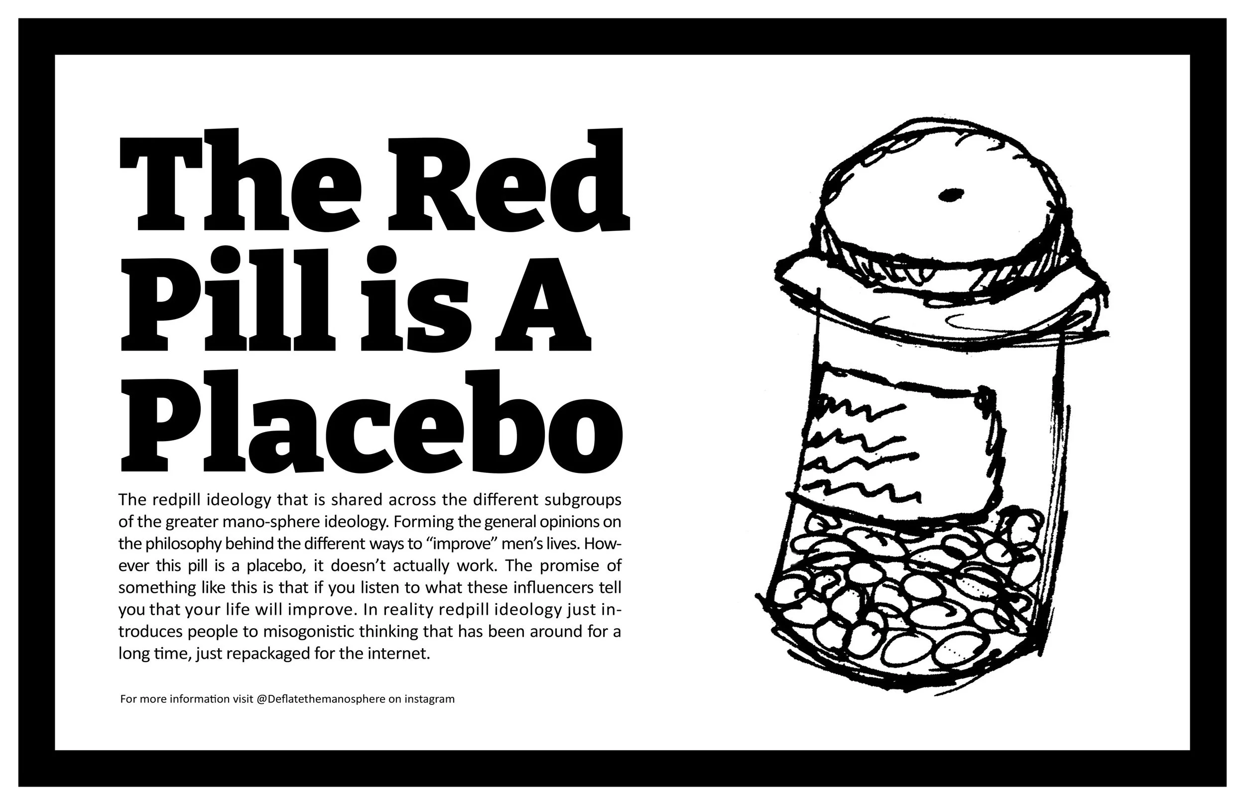
The Mano-Sphere
A Campaign Against the Mano-Sphere
How do you intelligently combat anti-intellectualism?
Strategy
I wanted to make sure each strategy decision was made with the data to back it up. Combatting Anti-intellectualism is difficult enough on it’s own, but allowing the combination of design and knowledge to create a pathway for people to learn about these complex ideas is very realistic. Many campaigns have tried to reach this group of people with varying degrees of success; so what worked, and more importantly; why did it work?
Design
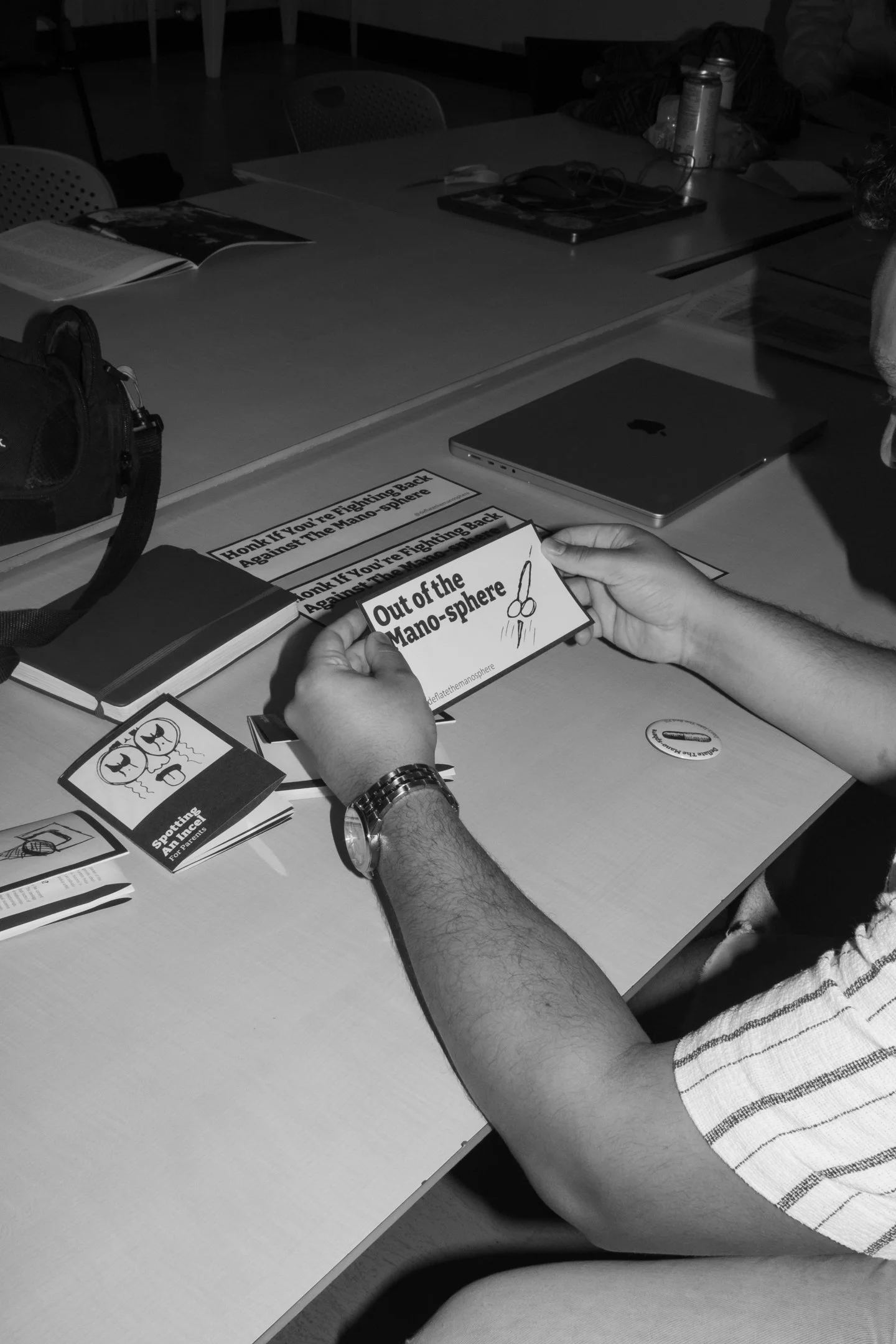
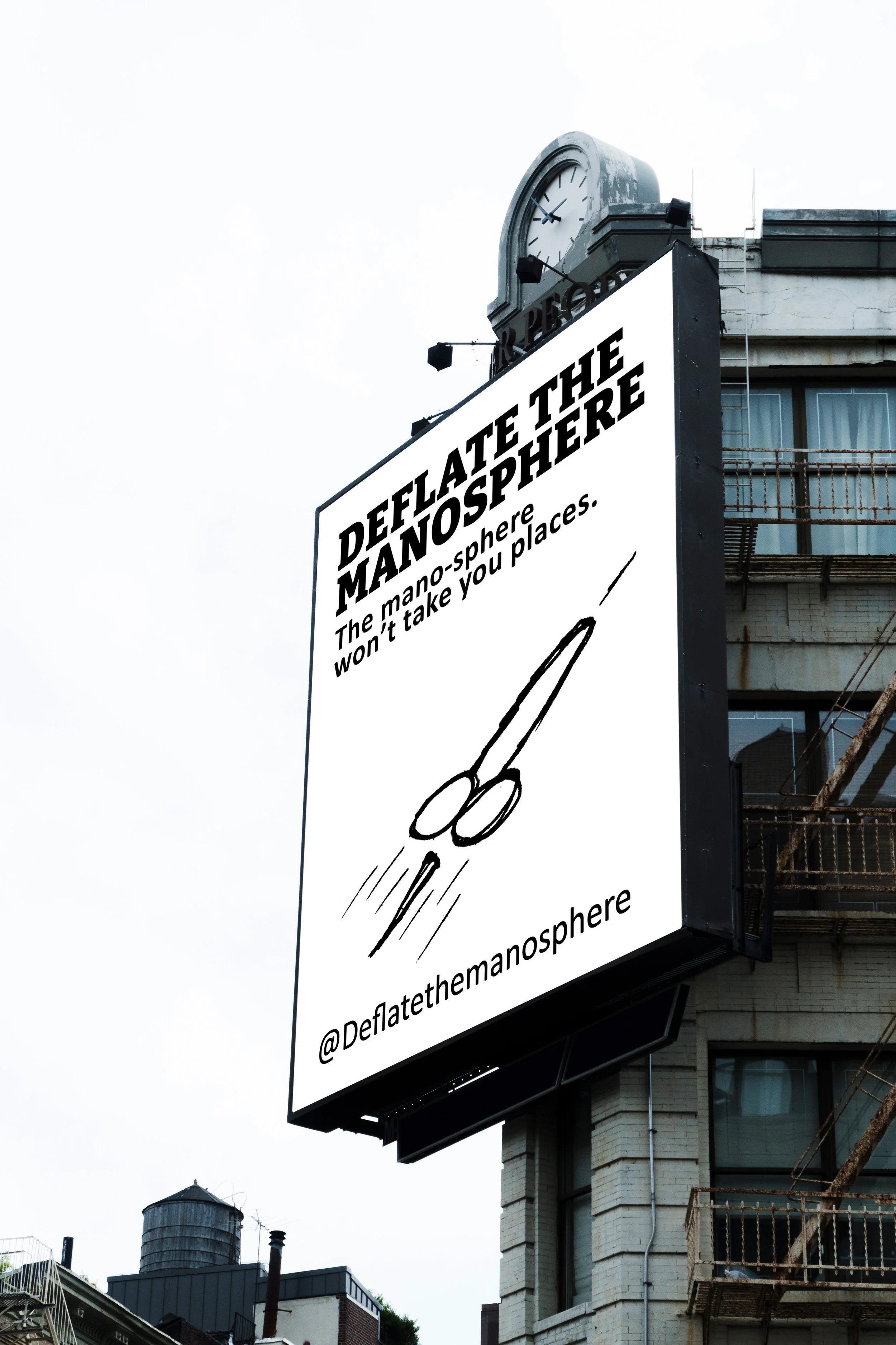
The design of this campaign is a direct connection between the needs for the information to be clear and concise, as well as the need for the campaign to be visually and monetarily accessible.
Color
The lack of color is a parameter that allows the promotion of this campaign to be accessible to more groups of people. Black and white zines and posters can be printed cheaper on more types of printers faster. The black and white image is also visually accessible, accounting for the fact that our target demographic is also one of the demographics most prone to colorblindness. The high contrast between white and black also helps with readability.
Type
The choices for type are simple but also historically relevant. Calibri is used for body text, because it was designed to be easy to read. Calibri is so easy to read that it was implemented in government documents as a way to increase DEI initiatives, replacing Times New Roman. This was later reversed in late 2025. The display typeface Bitter, a low contrast humanist serif typeface, calls back to the 1960’s civil rights movement in bold heavy weight letterforms. Both of these typefaces are available in their entirety as free open source fonts, allowing anyone to design with them free of charge.